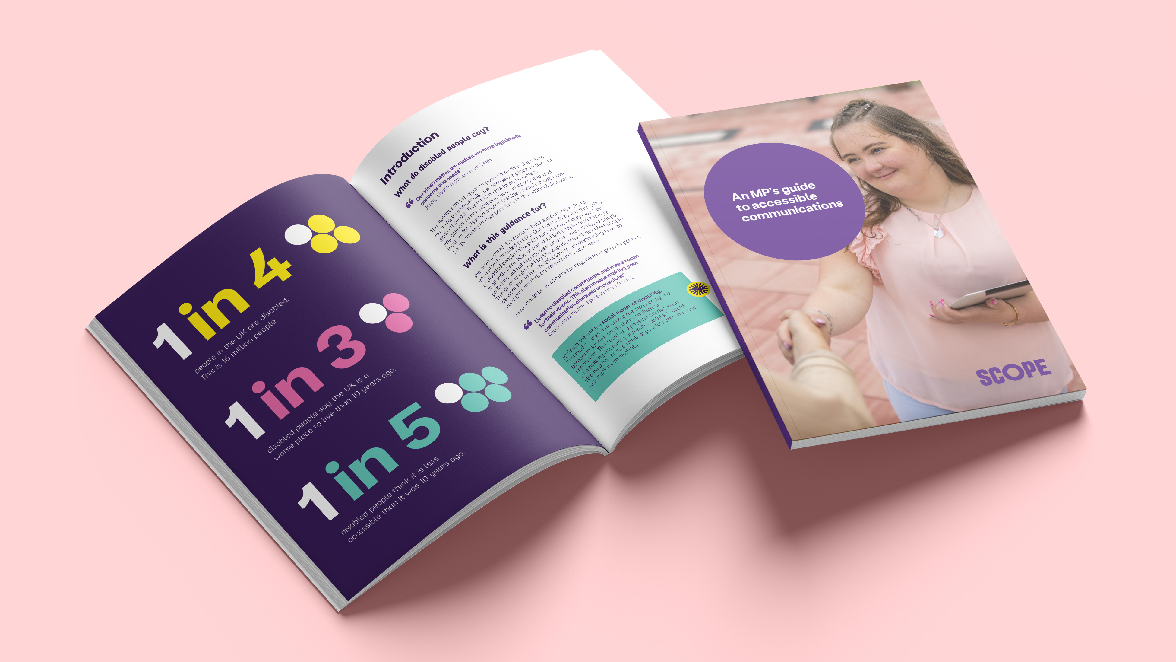
Accessible communications guide
Client: Scope
Brief
︎
Produce a printed guide for MPs which explains accessible communication.
Role
︎
Design, typography, layout.
Outcomes
︎
89% of disabled people in the UK think that politicians do not engage with them well or at all. I designed a guide to help MP’s communicate accessibly with their constituents. Using Scope’s recently refreshed brand I created a clear and engaging design style for this guide and future long-form documents.
The design showcases Scope’s fun, vibrant refreshed brand whilst still being clear, informative and relevant to the audience.
The layout uses a narrower text column, creating white space and a shorter line length which is more accessible for readers.
Text is broken up using coloured boxes and infographics which are engaging and easier to digest.


Brand new range packaging
Client: Scope
Brief
︎
Create a new packaging design concept for the ‘Brand new’ items in our charity shops.
Role
︎
Design.
Outcomes
︎
I designed a packaging range to elevate Scope’s ‘Brand new’ products whilst still presenting them as good value. Using the dark purple colour from the brand palette with pops of brighter colours in the text created a modern, functional style.
The design system can be adapted across a range of products and the use of different coloured text creates variety and interest.


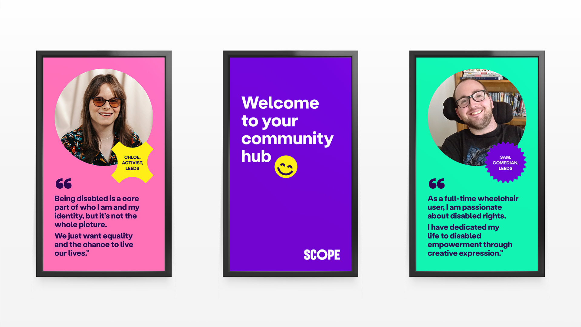
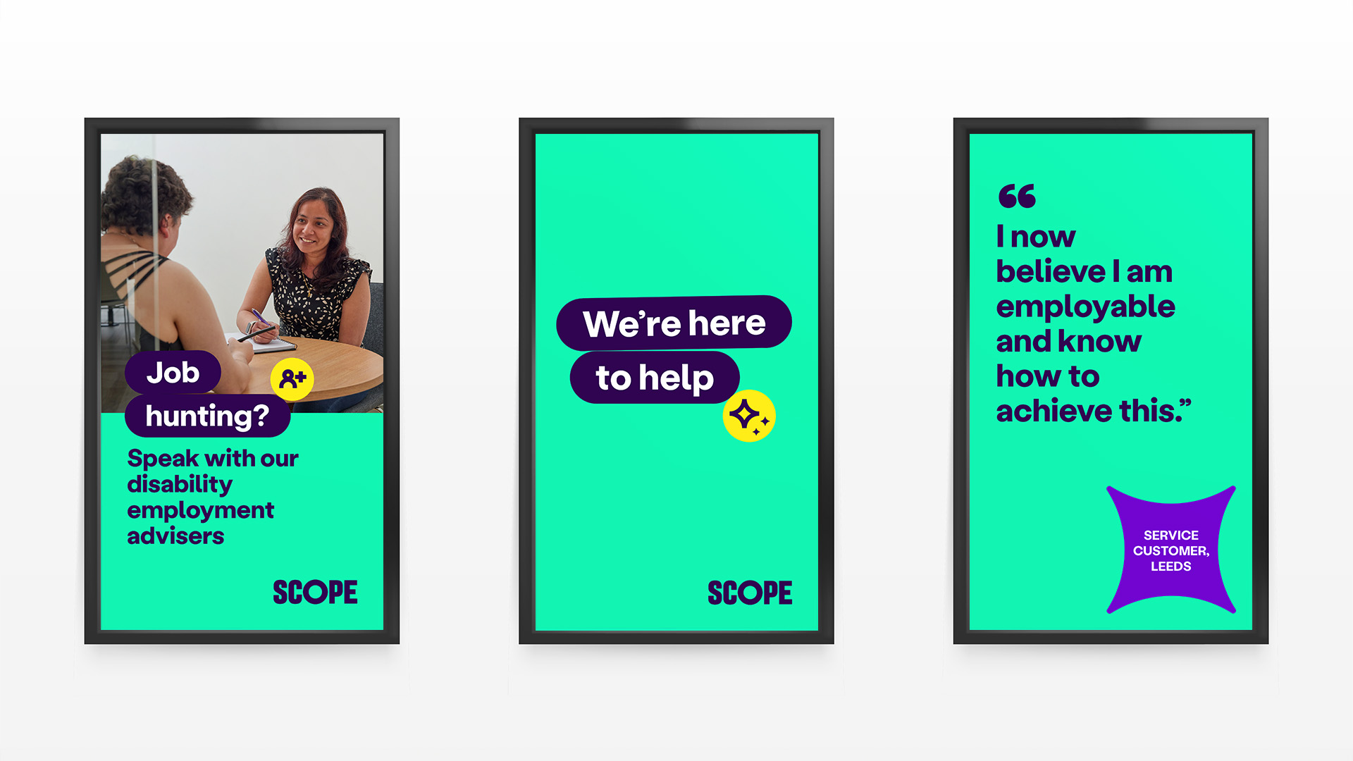
Animated timeline
Client: Scope
Brief
︎
Produce a timeline of our charity’s history to feature on the screens in our Community Hub.
Role
︎
Design, animation.
Outcomes
︎
I was asked to produced a static slideshow, including a timeline and some informative advertisements to be shown on three side-by-side screens at Scope’s Community Hub. I pitched creating an animated timeline which would be more engaging and celebratory of Scope’s history.
I used elements from Scope’s recently refreshed brand, including the flourish shapes and action lozenges to create bold and attractive designs which would catch the attention of visitors.
I ensured that the font size was large enough and that animation transitions were spaced appropriately to allow for accessible reading.
The sreens hold for one minute between each animated transition to allow for accessible reading time.
As well as the animated timeline I also designed a series of informative static screens.
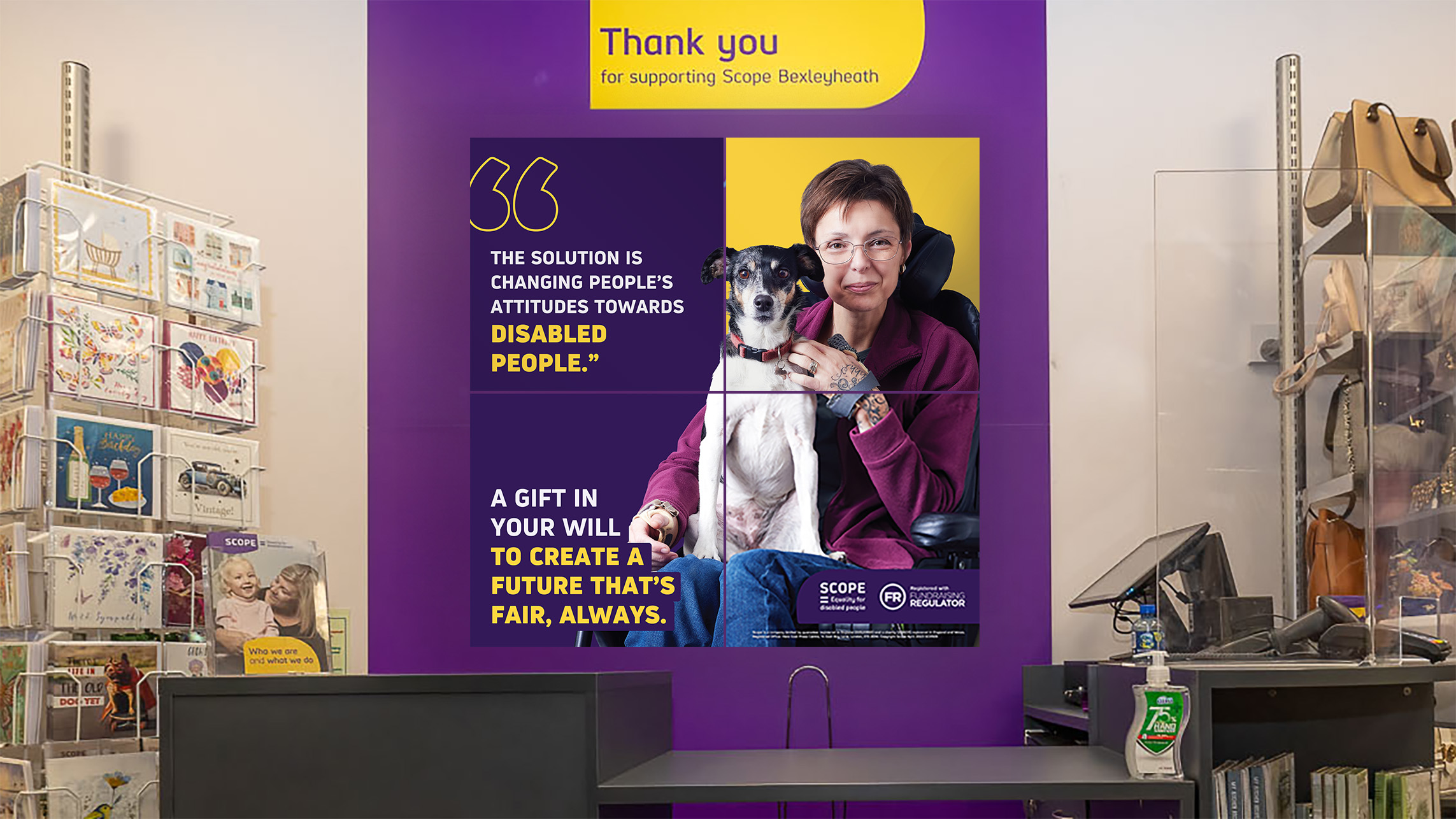
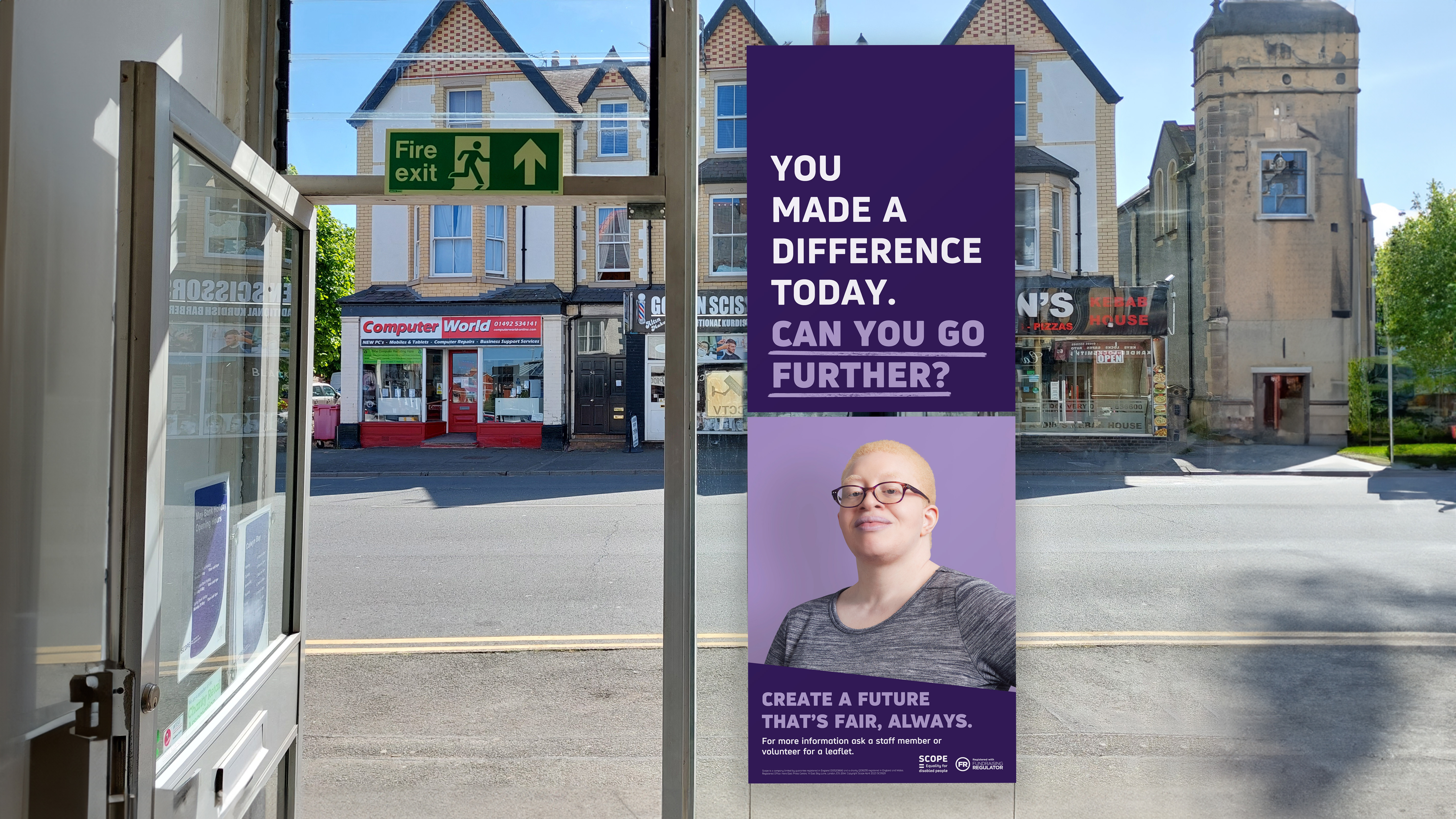
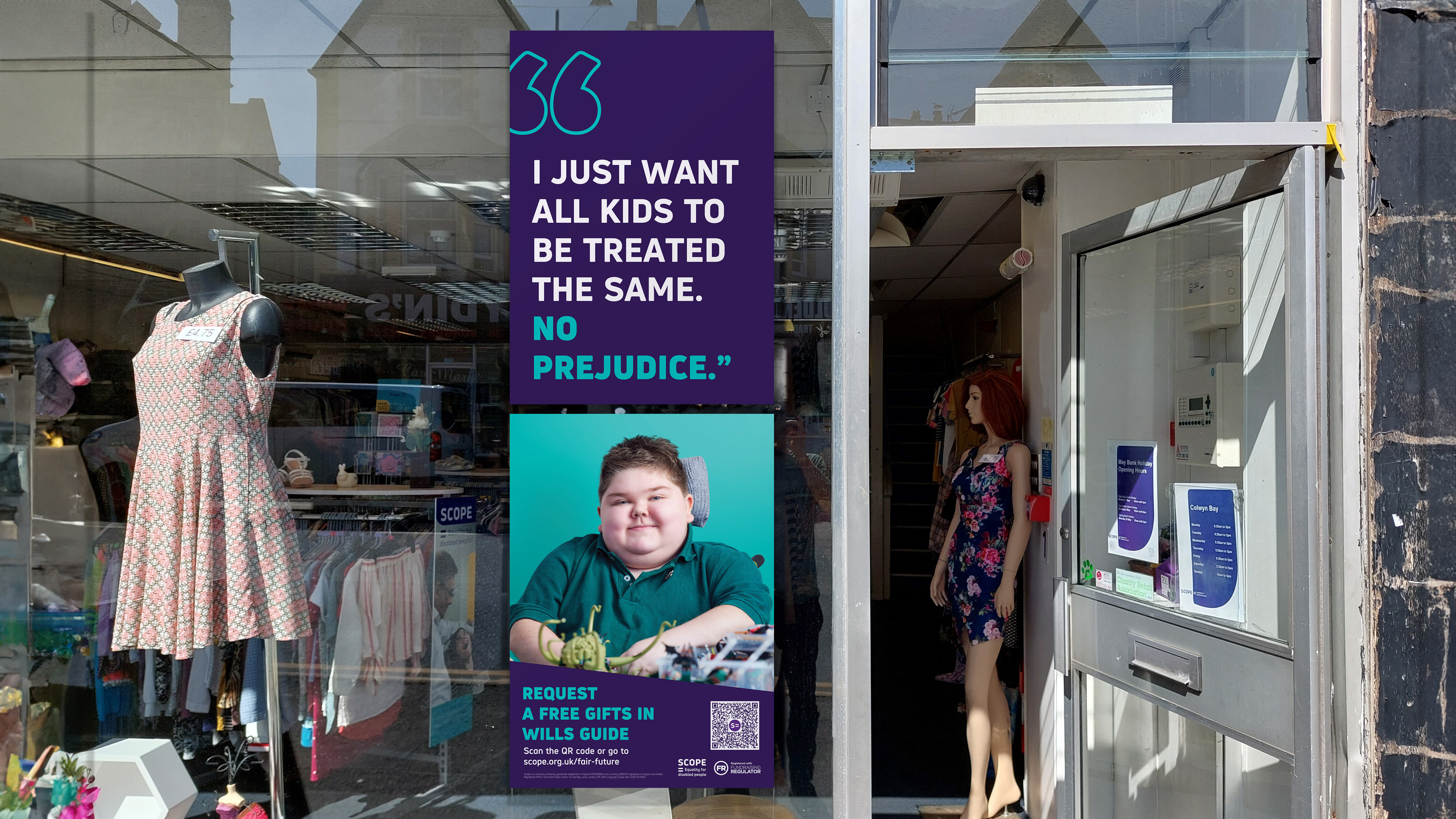
Fairer Futures
Client: Scope
Brief
︎
Produce a new campaign to encourage people to remember Scope in their will.
Role
︎
Design, artworking, animation.
Outcomes
︎
I produced the final artwork for the campaign posters which were displayed in Scope shops. The poster designs championed the real people behind the quotations whose wishes could be achieved with the help of gifts in wills.
I also produced animated social media adverts for the campaign, using a glow effect to draw attention to the speech marks and quotations.
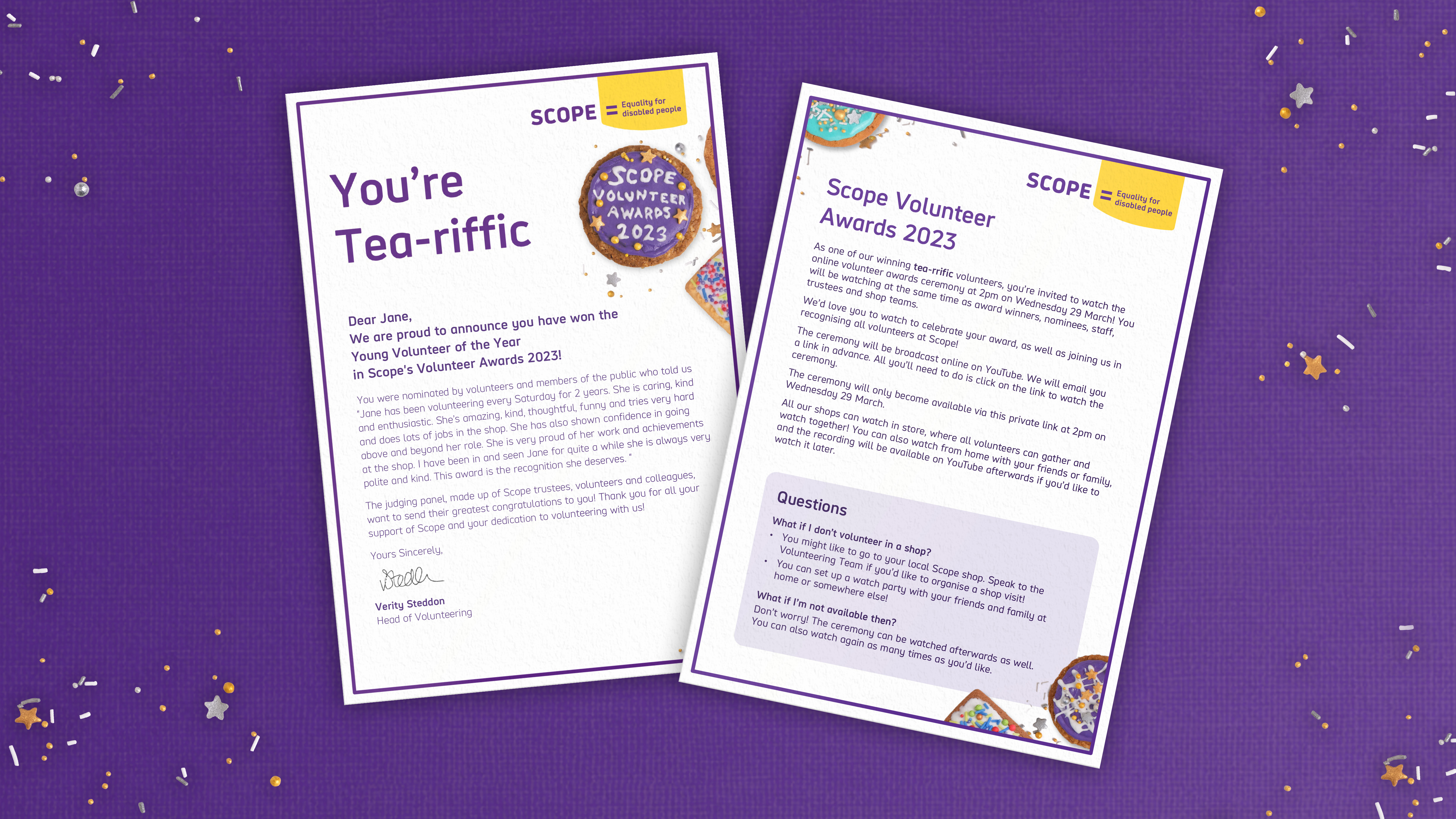
Scope Volunteer Awards
Client: Scope
Brief
︎
Create a new visual style for the Volunteer Awards that represents our volunteer community.
Role
︎
Design, biscuit decoration, photography direction.
Outcomes
︎
Coproduction with volunteers inspired the tea and biscuits theme which represents daily moments of joy shared between volunteers at work and the treats which they would share at the celebrations held in Scope shops on the day of the awards.
I developed a photographic concept, hand decorating biscuits in Scope’s brand colours to represent the hands on work of volunteers.
After directing and editing the photography of the biscuits, I designed the print communications for the awards, including strut cards to be displayed in Scope shops and letters and certificates.
Results
︎
The unique and playful visual style appealed to volunteers and members of the public, resulting in an over 200% increase in nominations compared to the previous year.